Behind the website · Design case study
A clear foundation.
A hardworking
website.
A website for A1 Paving Asphalt that puts the services, the property, and the next conversation first.
Explore the design decisions ↓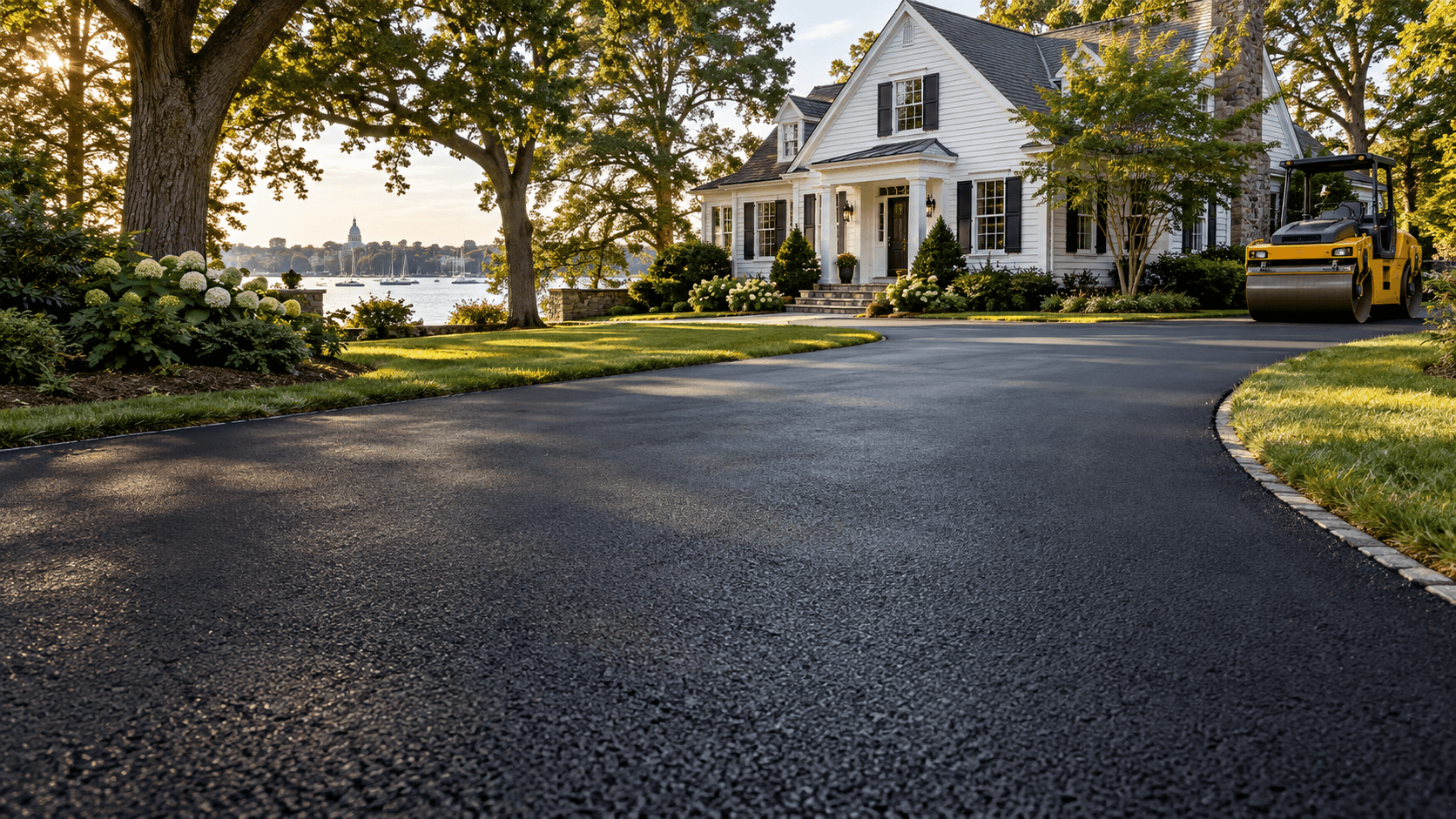
- The business
- A1 Paving Asphalt
Polk City, Florida - Design & development
- Designquik
- The focus
- Clear services.
A useful next step.
01 / The starting point
Make the work
easy to understand.
A homeowner considering a driveway and a property manager planning a parking area arrive with different questions. The website needs to show what A1 Paving offers, where it works, and how to start a conversation about the property.
Designquik built the information around those tasks. The homepage introduces the business and the estimate request together. Service pages explain the options in more detail; planning guides help visitors prepare before they call.
The published pages bring the visual direction, information structure, and visitor paths together. Each decision gives the business a clear way to introduce its work and explain the next step.
02 / The visual language
Built around
the character of the work.
Bold, direct typography
Condensed Bebas headlines give the page a strong, practical voice. Barlow body text carries the explanations, service details, and form labels in a more open, readable rhythm.
Contrast with a purpose
Charcoal anchors the design. Yellow marks important actions and headings; orange adds warmth. Light sections separate longer explanations from the darker service and contact areas.
Surface, scale, and context
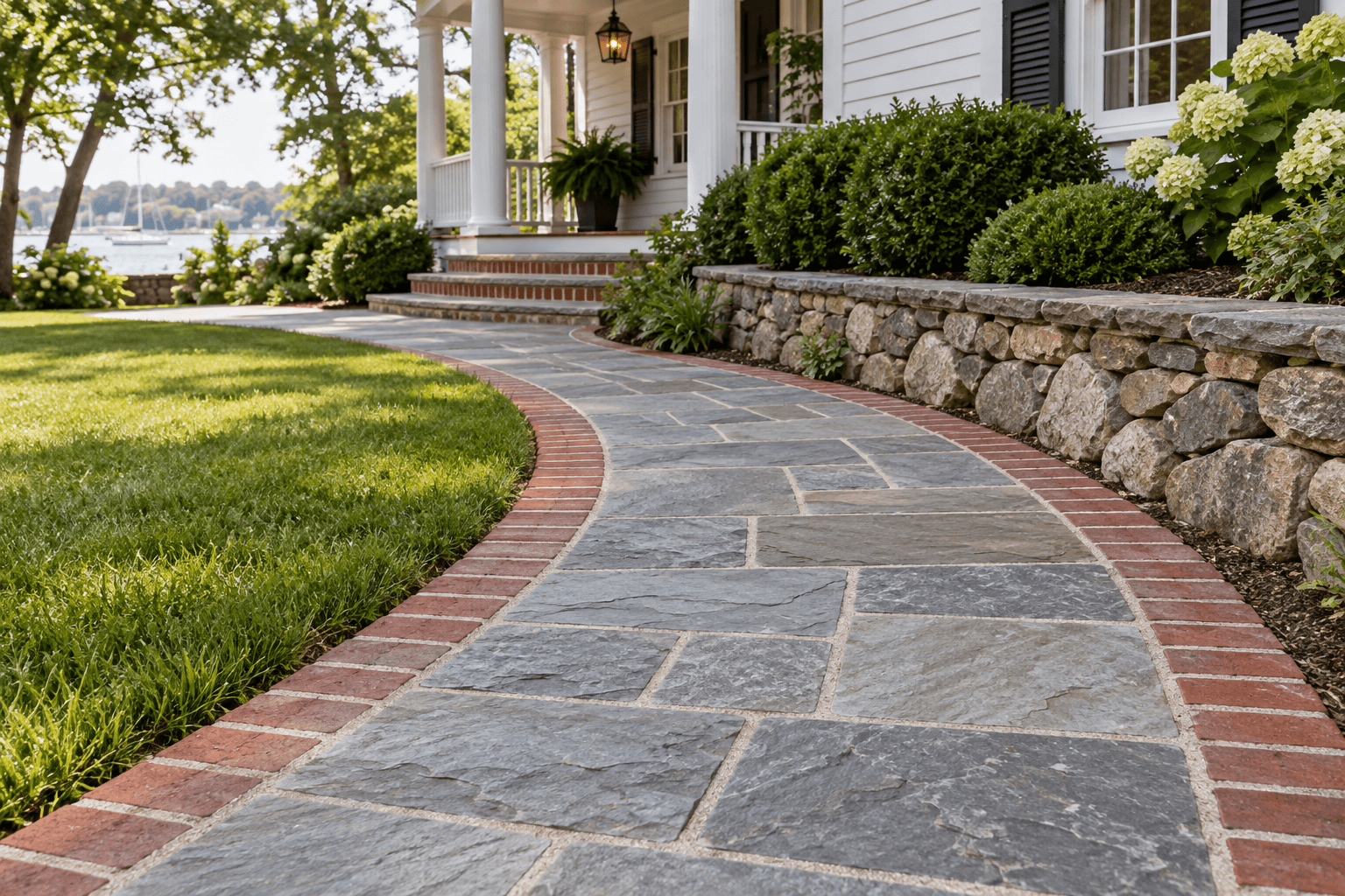
Driveway, pavement, and stone imagery helps visitors recognize the kind of work being discussed. The planning gallery identifies its images as references, keeping visual inspiration separate from claims about completed A1 projects.
03 / The visitor journey
From a question
to a conversation.
Three connected paths help people understand their options before asking for a property-specific recommendation.
- 01
Find the right service
Dedicated pages cover asphalt paving, sealing and patching, stone and gravel, masonry and stonework, and line striping.
- 02
Understand the property
The cost guide, paving guides, and FAQs explain why use, access, preparation, and drainage matter. Location pages give Polk County and Orlando-area visitors a relevant starting point.
- 03
Start with a clear next step
The phone action stays visible in the header. The homepage estimate form and contact page ask for useful project details, giving visitors a direct way to request a conversation.
04 / Across screens
The same purpose.
Room to adapt.
On desktop, the homepage places the introduction beside an estimate form. On smaller screens, the content stacks into a clear reading order and the navigation becomes a compact menu. Service cards and longer explanations adjust to the available width.
The design keeps the business message and contact paths consistent across those layouts. This case-study page also respects reduced-motion preferences: its optional Designquik entry transition is skipped when reduced motion is enabled.
Explore the A1 Paving website →05 / The studio behind the website

Websites built
to last.
Designquik brought the information structure, visual design, and responsive development together around A1 Paving’s services and the questions its visitors need to answer.
Visit Designquik for website design and development →
Here to plan a paving project?
Request a free estimate →